Point Layer
Point layers display individual data points on a map using markers at specific latitude and longitude coordinates.
Configuration Options
Latitude Field
The field from your data source that contains the latitude values. Only numeric fields from your data source will be available for selection.
Longitude Field
The field from your data source that contains the longitude values. Only numeric fields from your data source will be available for selection.
Size
The radius of the point markers can be set to a single fixed size, or varied based on a data field to create a bubble map.
- Single Size: All points use the same radius. Set the size and choose whether it is measured in meters (scales with zoom) or pixels (constant on screen).
- Data-Driven Size: Point radius varies based on a numeric field (interpolated between a minimum and maximum size) or a categorical field (each category mapped to a size). This is what enables bubble maps.
For meter-based sizes, the Minimum Pixels and Maximum Pixels settings keep points visible without overwhelming the map as the user zooms.
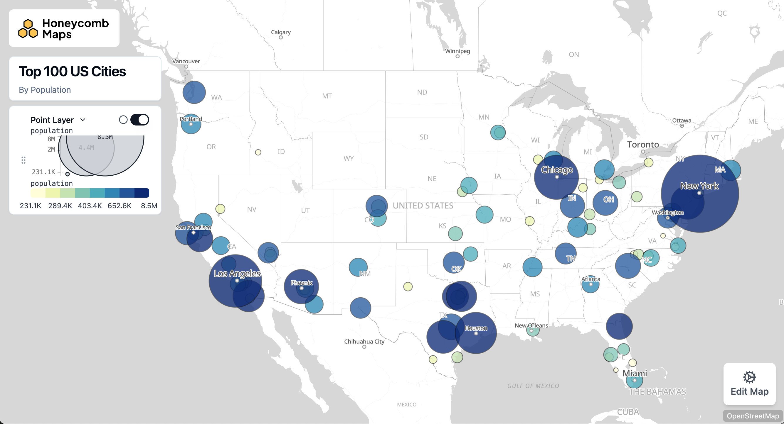
For complete details on size options, including interpolation types and the recommendation to use square-root scaling for bubble maps, see the Size Schemes documentation.
Outline
Points can optionally be drawn with an outline. Outlines are turned off by default. When enabled, a point defaults to a separate 1-pixel black outline.
- Enable Outline: Toggle whether an outline is drawn around each point.
- Outline Width: The width of the outline, in meters or pixels. Only a static (fixed) size is supported for outlines.
- Outline Opacity: The opacity of the outline.
- Separate Outline Color: Whether to use a separate color for the outline. If disabled, the point's fill color is used.
- Outline Color: The color to use for the outline, if 'Separate Outline Color' is enabled. Only a static color is supported.
Tooltips
Whether to enable or disable tooltips. Tooltips are displayed when a user hovers their mouse over a point and are useful for showing detailed information about specific points.
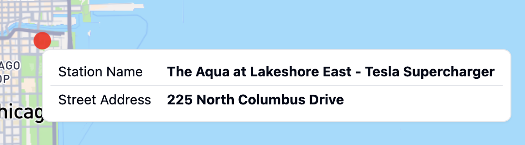
Tooltip Fields
The data fields that will be displayed in the tooltip. Only data fields from the same data source as the layer itself can be displayed in a tooltip. If no data fields are selected, the tooltip will not be displayed.
Tooltip Number Formatting
Numeric values displayed in tooltips can be formatted for better readability:
- Apply currency, percentage, or compact formatting to tooltip fields
- Add unit labels (e.g., "°F", "mph", "/hour")
- Configure decimal places and thousands separators
For complete details on formatting options, see Number Formatting.
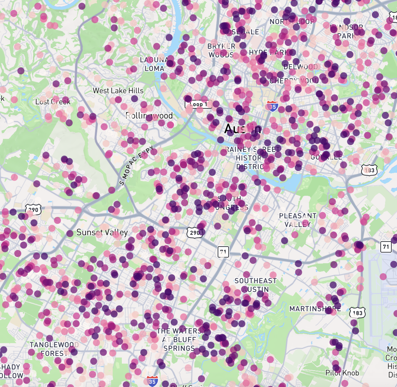
Color Configuration
Points can be colored in two ways:
Single Color Mode
When "Single Color" is selected, all points will be displayed in the same color. You can choose a color using the color picker
Color Scheme Mode
When "Color Scheme" is selected, points will be colored based on a data field using a color gradient or categorical colors.
Options include:
- Color Field: Choose which field to base the colors on
- Continuous fields (numeric data) will create a gradient
- Categorical fields (text data) will assign distinct colors to each category
- Color Scheme: Select from a variety of pre-defined color palettes
- Interpolation Type (for continuous fields only): Choose how to distribute colors across your data
- Value: Colors are distributed evenly across the full range of values
- Quantile: Values are bucketed into equal size groups, then each group is assigned a color
- Custom Discrete: Define your own value ranges and assign specific colors to each range
TIP
If your data has some values of zero and many very large values, all of the large values will appear as the same color using value interpolation. In this case, using quantile distribution will make the differences in values more visible, as the large values will still be grouped into different buckets. Alternatively, use Custom Discrete to define specific breakpoints that make sense for your data.
- Color Steps: Choose how many distinct colors to use in the scheme (3-9 steps)
- Reversed: Toggle to reverse the order of colors in the selected scheme. This is useful in cases where lower values are better and you are using diverging color scheme, such as visualizing pollution levels when you want green to be low and red to be high.
For detailed information about color schemes, including available palettes and configuration options, see the Color Schemes documentation.
For general options that apply to all layer types, such as Layer ID, Label, Visibility, and Opacity, see the Map Layers documentation.