Chart
The Chart component turns your map's data into interactive visualizations. It supports four chart types — horizontal bar, vertical bar, histogram, and treemap — each suited to different kinds of data. When configured as a filter, clicking or dragging on a chart filters the map and other components in real time.
Chart Types
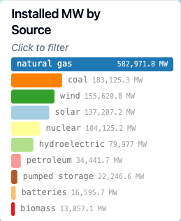
Horizontal Bar
Displays categories as horizontal bars, ranked by a numeric measure. Good for comparing values across categories when labels are long or numerous.
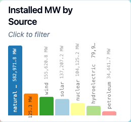
Vertical Bar
The same data as a horizontal bar chart, but with bars arranged vertically. Works well when you have fewer categories or want a more traditional chart appearance.
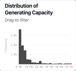
Histogram
Shows how numeric data is distributed across bins. Rather than grouping by category, the histogram divides a continuous numeric field into ranges and counts how many records fall into each one. Useful for understanding the shape of your data — whether values cluster around a center, skew to one side, or spread evenly.
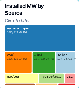
Treemap
Represents categories as rectangles whose area is proportional to their value. Treemaps make it easy to see which categories dominate and how smaller categories compare at a glance.
Interaction
Horizontal bar, vertical bar, and treemap charts support click-to-filter. Click a bar or rectangle to filter the map down to that category. Click it again to deselect. If multiple selections are enabled, you can select several categories at once — selected items stay at full color while unselected items are dimmed.
Histograms use drag-to-filter instead. Click and drag across a range of bins to filter the map to records within that range. Click outside the selection or use the reset button to clear.
Configuration
Title
A label displayed at the top of the chart.
Subtitle
Descriptive text shown below the title. This is a good place for brief instructions like "Click to filter" or context about what the chart shows.
Data Source
The data source the chart pulls from. This must be one of the data sources already added to your map.
Chart Type
Choose between Horizontal Bar, Vertical Bar, Histogram, or Treemap. Switching chart types will carry over compatible settings — for example, switching from horizontal bar to treemap preserves your category and measure fields.
Categorical Chart Settings
These settings apply to horizontal bar, vertical bar, and treemap charts.
Category Field
The categorical field that defines the groups in your chart. Each unique value becomes a bar or rectangle. Examples: energy source, state name, product category.
Measure Field
The numeric field that determines bar length or rectangle area. Examples: revenue, population, count of records.
INFO
If a numeric field from your dataset doesn't appear in the measure field dropdown, it may have been assigned a string data type. Check the data sources menu to verify.
Aggregation Type
How values are combined for each category:
- Sum — total of all values
- Average — mean value
- Count — number of records
- Count Distinct — number of unique values
- Minimum / Maximum — smallest or largest value
- Median — middle value
Max Categories
Controls how many categories appear on the chart, from 1 to 100. Defaults to 10. Categories are ranked by their aggregated value, so you always see the most significant ones.
Sort
Determines the order categories appear in:
- By Value — sorted by the aggregated measure (ascending or descending)
- By Label — alphabetical order (ascending or descending)
- Natural Order — the order categories appear in the data
- Custom Order — specify an explicit ordering by entering category names
TIP
Treemap charts only support sorting by value, since the layout algorithm arranges rectangles by size.
Histogram Settings
These settings apply only to histogram charts.
Numeric Field
The continuous numeric field to analyze. The histogram divides this field's range into equal-width bins and counts how many records fall into each.
INFO
If a numeric field from your dataset doesn't appear in the dropdown, it may have been assigned a string data type. Check the data sources menu to verify.
Number of Bins
How many bins to divide the data into. Defaults to 20. More bins give finer detail; fewer bins show broader patterns. Values from 2 to 200 are supported.
Y Scale Type
- Linear — standard scale where equal distances represent equal values
- Logarithmic — compresses large values, useful when a few bins have much higher counts than the rest
Axis Labels
Custom labels for the X and Y axes. If left blank, labels are generated automatically from the field name.
Scale Range
By default, axes scale automatically to fit the data. You can switch to a fixed range by specifying minimum and maximum values for either axis. Fixed ranges are useful when comparing histograms across different filters or time periods.
Color
Static Color
By default, all bars or rectangles use a single color. You can change this color in the color settings.
Color Scheme
For richer visuals, switch from a static color to a color scheme:
- Categorical charts use a color palette (like Set1 or Paired) that assigns a distinct color to each category. You can also customize individual category colors after selecting a palette.
- Histograms use a continuous color scheme (like YlGn or Blues) that maps color intensity to values across the bins.
Color By Field
For categorical charts, colors are based on the category field by default. You can change this to color by a different categorical field from the same data source.
Number Formatting
Controls how numeric values are displayed on the chart. Options include auto formatting, fixed decimal places, percentages, currency, compact notation (K, M, B), and custom patterns. See the Number Formatting Reference for details.
Filtering
Function as Filter
When enabled, user interactions with the chart (clicking bars or dragging on a histogram) filter the map and other components.
Allow Multiple Selections
Available for categorical charts only. When enabled, users can select more than one category at a time. The filter includes data matching any of the selected categories.
Apply Filter To
Choose which map layers and components are affected by this chart's filter. By default, the filter applies to all layers using the same data source.