Geospatial Indexing: How to get the most out of your data
Summary
Geospatial indexing is a powerful technique that serves a variety of purposes like accelerating database retrieval, facilitating spatial joins, enabling data aggregations, and enhancing visualizations. There are different types of geospatial indexes, each with its own strengths and weaknesses. While geospatial indexing can seem complex at first glance, in this post we will demystify the topic and help you unlock a dynamic tool for GIS, mapping, and location intelligence.
Indexes
To fully understand geospatial indexing, it can be helpful to see its parallels with traditional data indexing. When you index data, you are creating a system to retrieve said data that doesn’t require scanning through the entire dataset from beginning to end. Imagine searching through thousands of books in a random order at the library until you find what you are looking for. Just like how books in the library are arranged in a way that makes them significantly easier to retrieve, most databases use an index for faster data retrieval.
Because of the unique nature of geographic data, traditional indexing algorithms cannot be applied to locate their physical locations. Geographic data exists in two dimensions and is represented by points, lines, polygons, and rasters. Therefore, different methods must be employed to make data retrieval fast and efficient. Some geospatial indexes also have the advantage of allowing unlike data sets to be joined and aggregated by location as well as used for powerful visualizations. This is a game-changer for data analysis.
Examples of Geospatial Indexes
Database Indexes: These types of indexes are implemented in databases where geographic features are stored. For each feature, a bounding box is calculated. These bounding boxes provide a first-pass test for spatial operations to eliminate irrelevant features and only perform costly spatial analysis on those that are proximal. Database indexes cannot be used to aggregate data.
Geohash: Geohash is an algorithm that divides the world into a hierarchical rectangular grid structure, also known as a quadtree. Each rectangle can be further subdivided into smaller and smaller nested rectangles to achieve higher resolutions. The rectangles are represented by a character string where the parent rectangle is always one character less e.g. 9 represents the largest grid unit and 9v is a rectangle nested within it.
S2: S2 is an open-source, discrete, global grid system that divides the world into squares. Each square receives a 64-bit integer ID, making them efficient for large data sets. The squares can also be subdivided into four smaller squares that nest perfectly within the parent square. Noticeable distortions are visible when used in map projections.
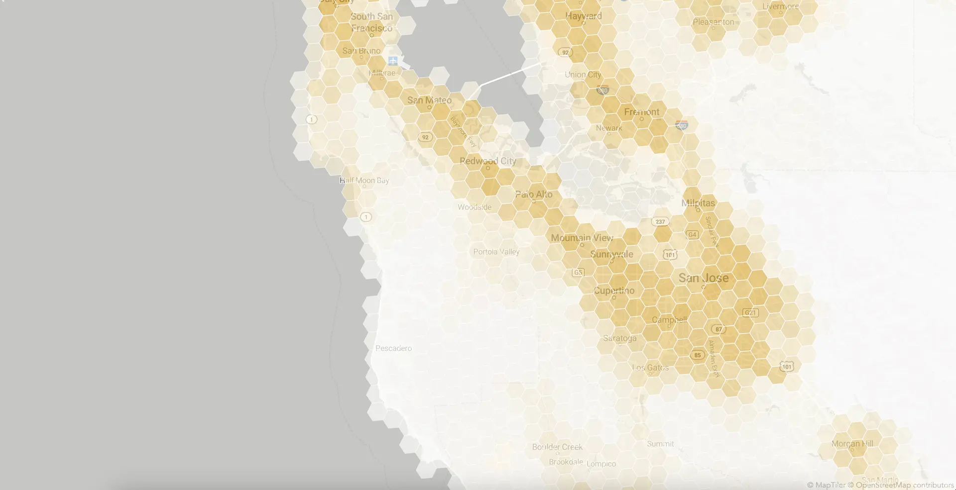
H3: H3 is also an open-source, discrete, global grid system that divides the world into hexagons. And like S2, each hexagon receives a 64-bit integer ID and can be subdivided. Unlike S2, each hexagon is subdivided into six smaller hexagons. By their nature, hexagons do not nest perfectly within each other. Despite this, the use of hexagons confers a number of other advantages:
- Shape distortion due to map projections is less noticeable.
- Hexagons have six equidistant neighbors in contrast to squares with two classes of eight neighbors: four edge neighbors, and four corner neighbors.
- Gradients and continuous data are easier to capture in visualizations.
Using a grid index for geographic analysis
Besides faster data retrieval, indexing your geographic data to one of the global grids described above has multiple advantages.
Joins
With a grid index, it is no longer necessary to compute costly spatial operations. Joining data becomes a matter of matching grid IDs, something for which databases are optimized. Indexes like S2 and H3 both employ 64-bit integer IDs that can be read as strings or integers for greater flexibility and performance. Depending on implementation and spatial operation, it is possible to see performance gains running from 1.2x up to more than 10x.
It is also easier to combine unrelated data sets. The discretization of points, lines, polygons, and rasters puts all data on the same spatial playing field. Data sets as disparate as weather, demographics, mobility, and physical features become trivial to combine and analyze geographically.
For example, spatial joins could be used to locate micro-mobility scooters in mandatory parking zones. The parking zones would be indexed into a series of hexagons and the scooter's latitude and longitude coordinates would also be indexed into one hexagon. Checking if a scooter is within one of these zones would be as simple as matching Hexagon IDs of the same resolution.
Aggregations
Due to the modifiable areal unit problem, aggregating data to compare zones or regions can be statistically challenging. For example, the irregular shapes of zip codes, census districts, and voting precincts make it cumbersome to extract their underlying data sets and combine them with others. This is solved with a global grid because all units are of the same size. Moreover, they can be aggregated upwards into larger and larger grid units depending on the necessary application.
Aggregations also make it possible to calculate statistics like averages, sums, medians, etc. Each grid cell can contain an array of precalculated statistics that aggregate upwards as necessary, performing the new statistical calculations on the fly.
For example, census, public record, and premium marketing data could all be combined with calculations like median age, average income, and total inhabitants per grid cell. If these cells are combined into a larger one, the new medians, averages, and sums are trivial to compute.
Visualizations
The combination of enhanced joins and aggregations allows for the creation of visualizations that go one step beyond heat maps. The continuous nature of global grid systems lends itself well to showing flows and gradients. And the combination of so many layers of discretized data provides nearly limitless flexibility to combine spatial data sets and enhance your decision-making capabilities.
For example, a table of data related to real estate that contains H3 indexes and home prices can be uploaded into a tool like kepler.gl to create visual analytics that uncover hidden trends.
How to index and visualize your data
The H3 library is quickly becoming one of the most popular ways to index location data. Here is a rough breakdown of how you can get the most out of H3.
- Decide where and how you will incorporate the index encoding into your data pipeline.
- Assign the indexes based on your business needs. Remember that you can always aggregate data into larger bins, but never smaller ones.
- Join all of your spatial data together on the indexes.
- Perform the statistical aggregations
- Visualize the data using kepler.gl, QGIS, or any other software with H3 capabilities.
As you can see, this process is quite involved and requires expertise in both data engineering and geospatial tools. Here is a more detailed guide for using Python with H3. But If you find yourself with a mountain of geographic data – like a table with latitude and longitude columns – and not enough time to create a solution yourself, then Honeycomb may be the solution for you.
Visualizing geospatial data with Honeycomb
Honeycomb is a lightning fast browser-based geospatial tool that makes indexing and visualizing your geographic data simple, with no special skills required. Simply load your data and Honeycomb takes care of the rest. With Honeycomb you can:
- Load a long list of data points with latitude and longitude values that are then indexed, aggregated, and visualized.
- Standardize and combine a variety of data sets on the same map.
- Enrich your data with free external datasets provided by Honeycomb. New data sets – population, home values, and average income to name a few – are added regularly.
- Share and embed the maps you create in a Python notebook, company wiki, or website.
- Maintain data privacy since no data leaves your machine. Everything is browser-based.
Make a map today
Below is a brief step-by-step guide to visualizing point data i.e. data with lat/lon coordinates. Feel free to use your own data set or one provided by Honeycomb.
- Go to the Honeycomb app- https://app.honeycomb.place.
- Drag your lat/lon data into the window to be automatically indexed to H3.
- Add a place polygon to see statistics for a particular area.
- Enhance your analysis with pre-baked data layers (click ‘Add Data’).
- See aggregated statistics for each layer in place window on the right.
- Save your analysis to a file, create a shareable link, or embed your maps in iframes so they can be viewed later.
Business use cases
Honeycomb can be used for location intelligence in a variety of industries. Here are just a few business use cases where Honeycomb could help you with your location intelligence needs.
1. Mobility: Demand Forecasting
Combine your internal mobility data such as ride starts and ends with location information like demographics, transportation hubs, commercial establishments, and bike lane placement to understand demand for your mobility solutions. This map could help you place micromobility parking hubs, increase rider capacity where and when necessary, or simply better understand your market demographics.
2. Geomarketing: App Events
Get the most from location-based app events. Use anonymized event data (e.g. where users opened an app or which location-specific campaign they used to download it) to create insightful interactive maps. And as always, they can be enriched with other data sets.
3. Public Data Sets
Because the indexing process standardizes data, you can start to leverage the power of public data sets like never before. Include crime statistics, earthquake data, population data – really anything you can get your hands on – in your spatial analyses.
Try Honeycomb Today
Create a map using Honeycomb’s App and see the power of H3 indexing for yourself. Example maps are provided to kickstart your creativity. For advanced cartographers, the technical documentation will help you to create more sophisticated visualizations.
Get in touch with Honeycomb to fully unlock the power of your geospatial data.